Ooink Ramen Rebrand
Branding | Advertising | Environmental Graphics
CHALLENGE:
Ooink Ramen offers a unique take on traditional ramen. Their current identity doesn’t reflect their uniqueness and lacks intentionality, and cohesion.
APPROACH:
The concept “Slurp up comfort” is the driving force behind the brand. Every detail in the design supports casual comfort: from the traditional Japanese colors of red and blue to provide warmth, to pictures of people enjoying each other’s company, and using organic textures to provide a uniquely visceral experience.
TIMELINE: 10 Weeks
ROLES + SKILLS: Illustration, Brand Guidebook, Packaging, Environmental Graphics, Print Advertising
TOOLS: InDesign, Illustrator, Photoshop, After Effects, Miro, Figma
COLLABORATOR: Tristan Pierce
RESEARCH & DISCOVERY
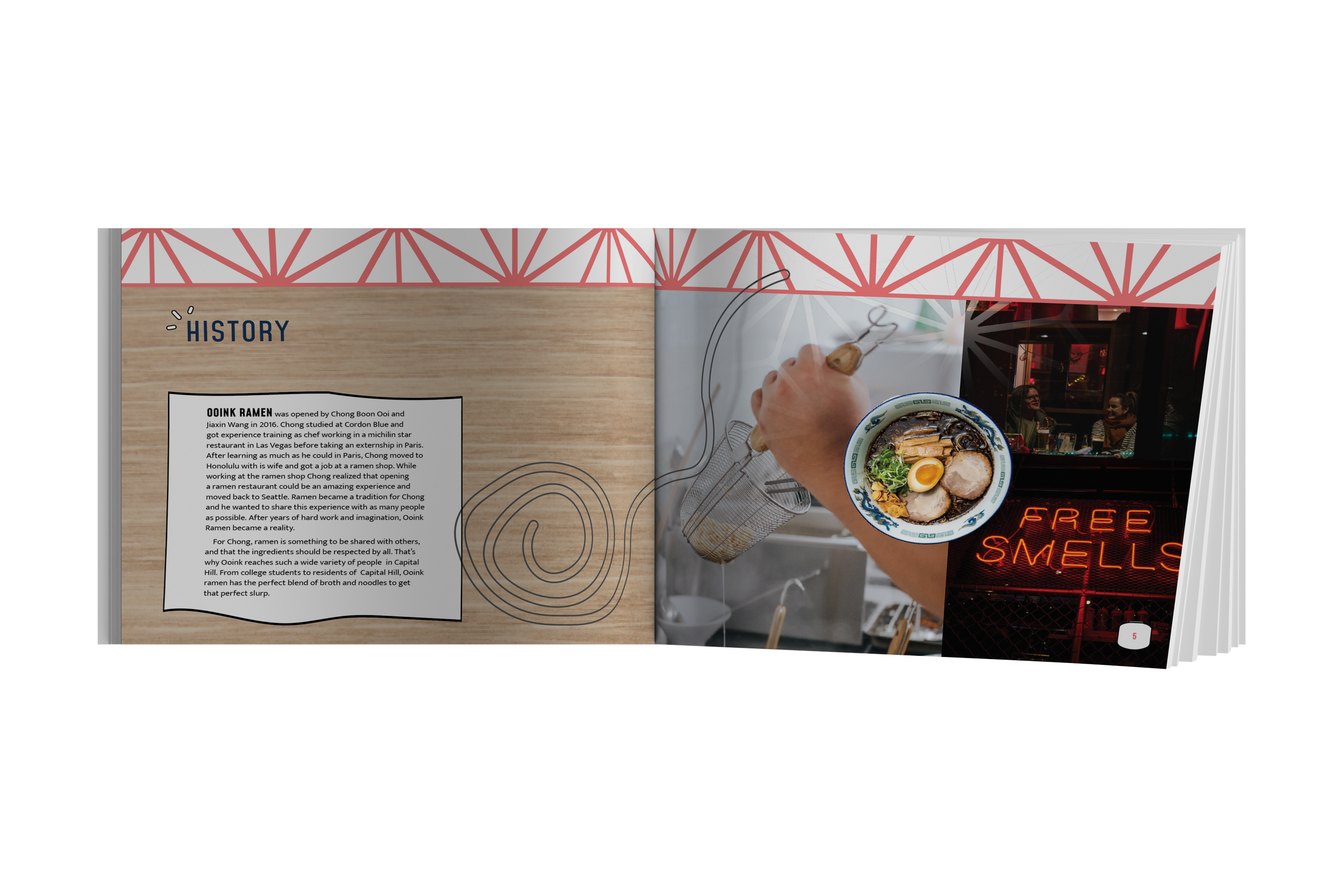
Since 2016 Chong Boon Ooi and Jiaxin Wang have provided Capitol Hill residents with ramen that stands out among the competition with the perfect blend of broth and noodles to get that ideal slurp. The process began with exploring the physical restaurant and the history and story behind Ooink Ramen. With an understanding of the restaurant's background, we worked through a visual brainstorming exercise of images to narrow in on the visual tone and voice of the brand. We found that the four most prominent brand characteristics are: Transparent, Social, Trendy, and Traditional.


Concept Development
Concept Board
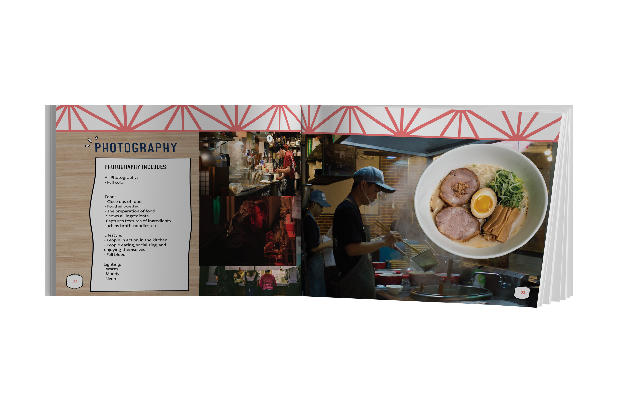
Working from the key brand characteristics, we narrowed down our concept and created the tagline "slurp up comfort." The concept board we created visually reflects the traditional tone by incorporating traditional Japanese colors and textures into the overall design. Using the traditional colors of red and blue, we were able to create a balance in color with our general warm feeling. Using pictures of socialization, we wanted to show how trendy Ooink is and that everyone, not just our intended audience, would enjoy a nice hot bowl of ramen from here. To include transparency, we wanted to keep some images raw and organic. Using full-bleed images and organic textures, we could capture the feeling of having nothing to hide.

Logo
We landed on a pictorial logo through exploration, including mind mapping, sketches, and refinement. The brand mark for Ooink Ramen represents the brand's character and promise. The typography conveys the brand's traditional qualities. At the same time, the pictorial mark is simple and modern, referring to Ooink's transparency and twist on the cuisine, coming together to invite people to slurp up comfort.


touchpoints
Creating a brand refresh for Ooink Ramen required designing across many platforms, including print, interactive, and environmental. Leaning into the illustration assets and creating a rule for traditional patterns set the foundation for deliverables that worked well collectively.


wayfinding
As part of the redesign, we wanted to bring attention to Ooink's storefront through environmental graphics. Ooink Ramen is in a highly trafficked area but can be easy to miss as it's on the second floor of a parking center. Attention-grabbing colors and illustrations from the graphics library point the passerby's gaze upward toward the entrance while the neon signage illuminates and invites people in to dine.


THE RESULT
Ooink Ramen lacked a design system that allowed for variation and adaptability while reflecting the brand's heart. Transparency was at the forefront of our redesign to create a warm and inviting experience rather than a quick bite. Organic shapes, traditional Japanese textures and colors, and elegant yet trendy typography all came together to make the redesign successful. However, using illustrations to evoke the hand-touched feel really brought the brand to life and created balance.