


Branding | Packaging | Advertising | Customer Experience
CHALLENGE:
Create a welcome kit for an eCommerce cleaning brand built around sustainability. Explore the customer experience from what incentivizes them to purchase green cleaning products to unboxing and continued patronage.
APPROACH:
Creating healthy habitats is the driving force behind the design. The goal is healthy habits for humans and bees. Our design decisions are based on showcasing that narrative.
TIMELINE: 10 Weeks
ROLES + SKILLS: Art Direction, Social Media Advertising, Illustrator, Photoshop, Figma, Webflow, After Effects
COLLABORATORS: Stephanie Liszewski, Bridget Shew
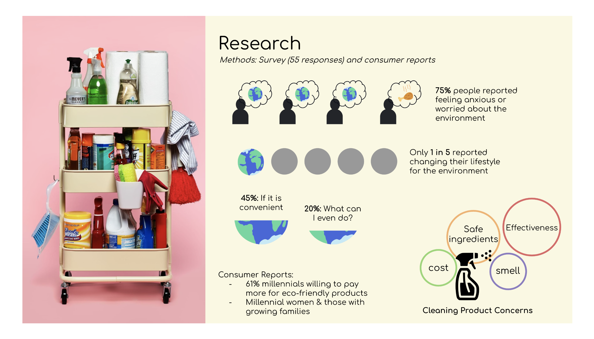
Research
"Going green" can be frustratingly complicated. To devise a content strategy, we conducted surveys to understand what felt complex about green purchases and identify our target demographic, their belief systems, and key differentiators. We found that 75% of people felt anxious or worried about the environment, but only 1 in 5 was likely to make changes to their lifestyle. Some felt confused or lost about the next steps, but overwhelmingly people needed it to be convenient. Consumer reports uncovered that 61% of millennials would pay more for a green cleaning product. Of that age demographic, women or people with growing families were likely to make the switch. Understanding our Personas allowed us to understand what jobs they would hire Clean Bee to accomplish.


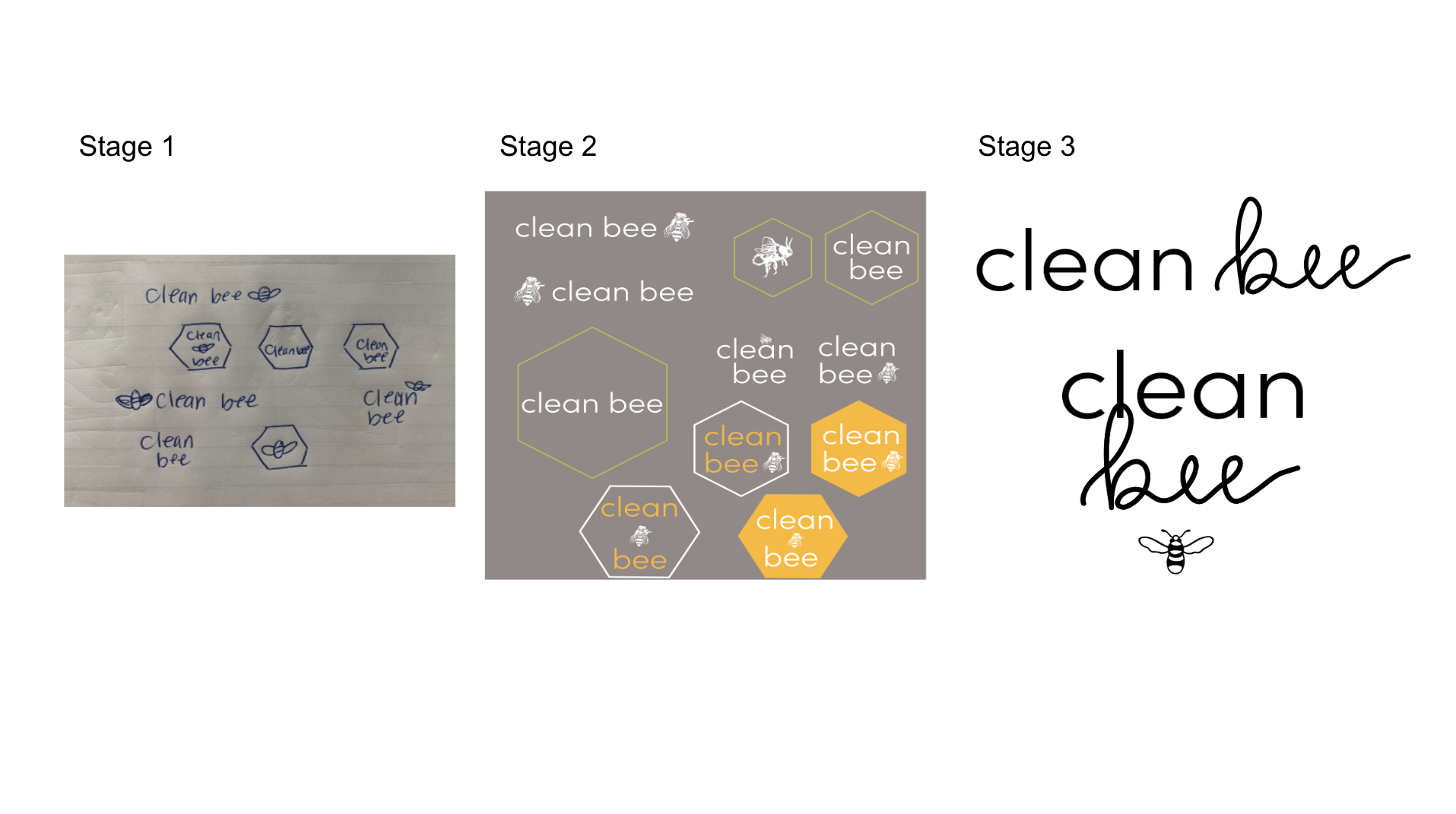
Logo Development
With approachability and cleanliness in mind, the logo uses a mixture of hand lettering and the font Sophia Pro Light. The pictorial mark of the bee went from highly detailed to simple for easy recognition and in various placements for playfulness.
CONCEPT DEVELOPMENT
Moodboard
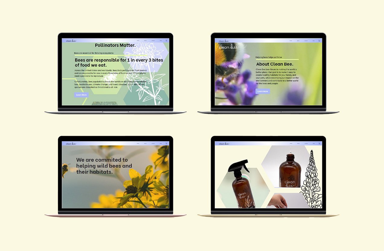
Our brand identity is elegant and approachable while reflecting our brand pillars. We want our customers to feel like they're bringing change into their homes at a reasonable price. Hexagons symbolize structural strength, nature, and bee hives. At the same time, decorative illustrations bring a sense of light-hearted and human-centric feeling. The prominent use of a soft yellow is attention-grabbing, warm, and energetic.

Touchpoints
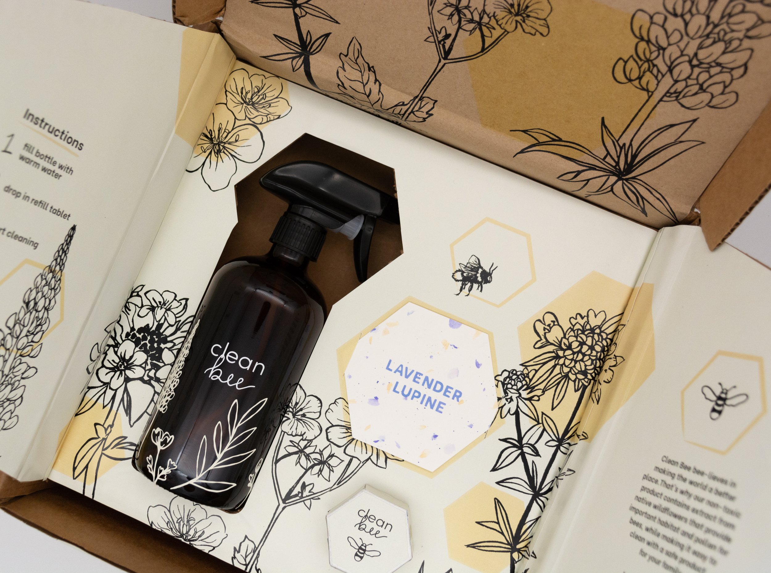
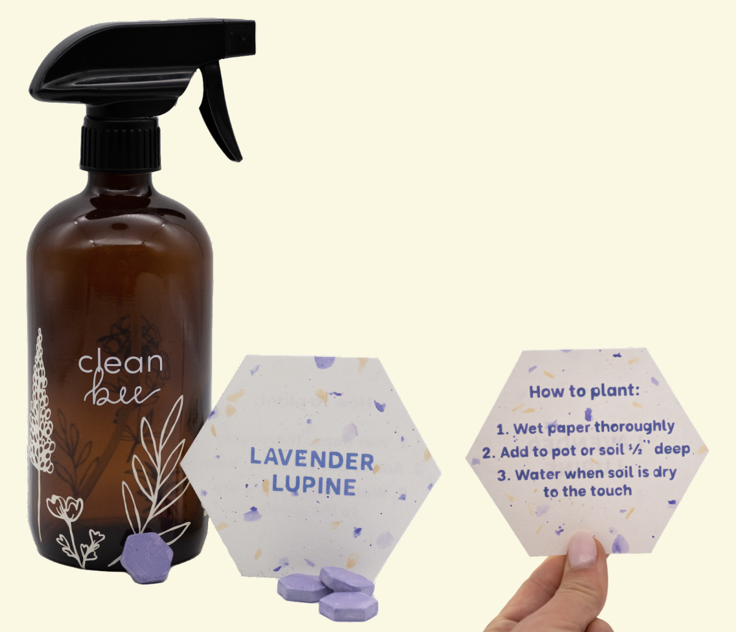
Ecommerce Packaging
Creating a memorable out-of-box experience (OOBE) started with market research and creating a moment map for the Clean Bee experience. We began brainstorming sketches, eventually narrowing concepts down from the top three to the top 1. After a few iterations, we finalized the dieline and brought our design to life.

Phase 1: Creating a moment map of the Out of Box Experience

Phase 2: Brainstorming package designs

Phase 3: Refining the chosen package concept

Phase 4: Graphic development and Mockup


Touchpoints
Interactive
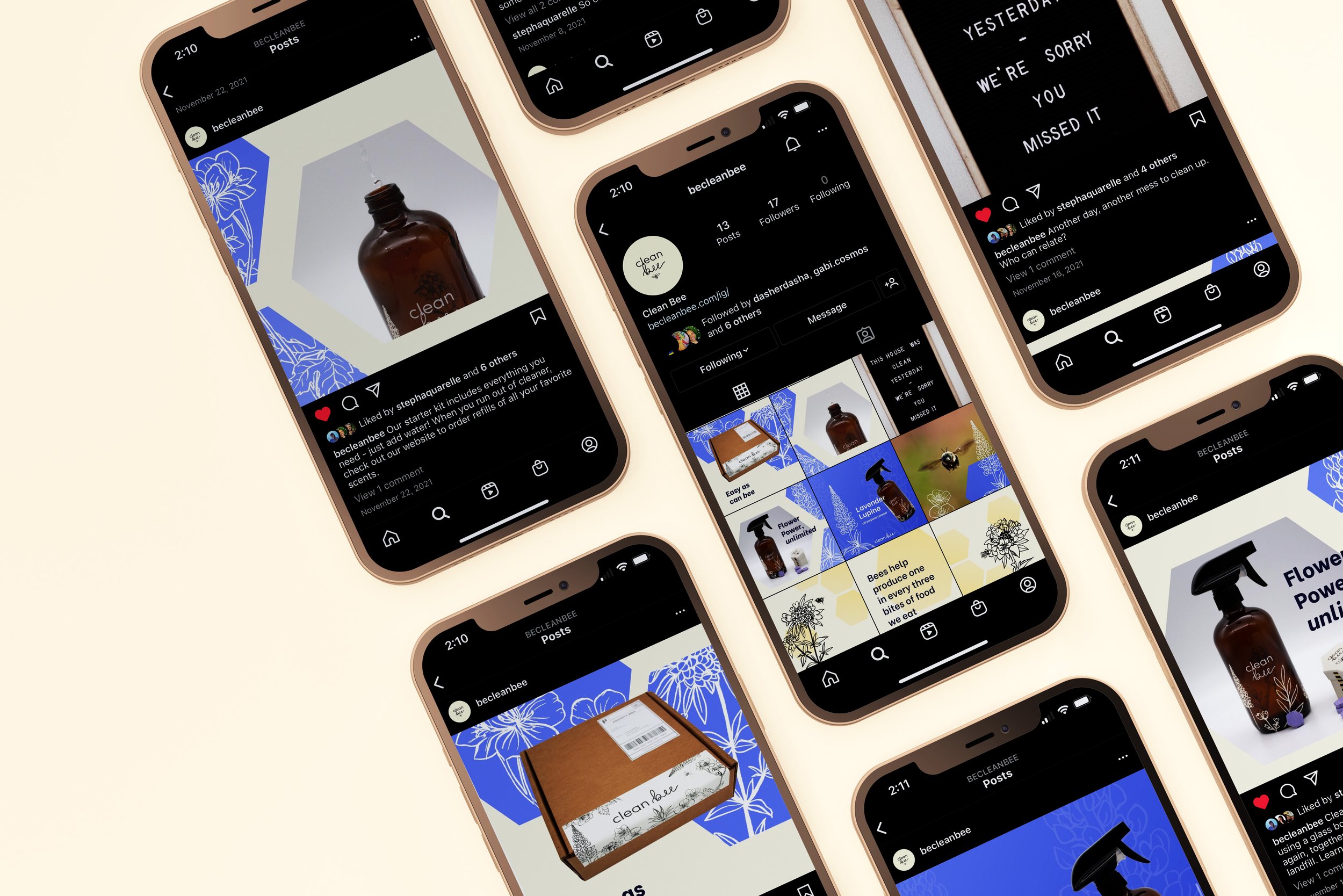
With our personas in mind, we sought to market via social media, changing the message based on the platform intending to speak to the targeted audience's interests. First, we collaborated on Miro to create a posting strategy, deciding how frequently to post and how to stay consistent with our message. Next, we made social media kits in Figma to include a photo library, illustration library, slogans, captions, and copy.
We used Figma and Webflow to create wireframes and the working site for different landing pages. The content of the landing pages varied based on whether the user was directed from Instagram or Facebook to align with their belief systems.

Creating a social media strategy with the intent to post 3x per week

Using Figma to create a social media kit including photo and illustration libraries and slogans, captions, and copy.

Execution of the social media strategy with our Instagram users in mind

Execution of the social media strategy with our Facebook users in mind


The results
At the end of this project, our A/B testing proved that Instagram produced a more engaging experience compared to Facebook. This includes more clicks to the landing page, more followers, and more likes.