

New Age Meats
Packaging
CHALLENGE:
New Aged Meats is on the cutting edge of developing cultivated meat. As we prepare for them to launch their first product to the public, there is an opportunity to educate consumers on the many benefits of cultivated meats through packaging design within their existing brand identity.
APPROACH:
Create a sub-brand for New Age Meats sausage links that tap into nostalgic colors, typography, and visuals to entice consumers in the 57-75 age range to purchase cultivated meats while staying within the current tone of the brand.
ROLES + SKILLS: Packaging Design, Solo Sub-branding, Wordmark Design, Pattern Design, Illustration
TOOLS: Adobe Illustrator, Photoshop, Fresco
research
Founded in Berkeley, CA in 2017, New Age Meats is a biotechnology company that develops healthy cultivated meat grown from animal cells instead of animal slaughter. They are committed to producing intensely flavorful meat that’s better for you, animals, and the planet. They hope to slash waste, curb pollution, and improve animal and human health. They are committed to enabling consumers to get the benefit of a clean environment and human health with worldwide food security.


Moodboard:
With the target audience in mind, I leaned into nostalgia and boldness by pairing fonts like Honey Script and Pragmatica Sabserif. I leaned into illustrated visuals to add detail to the product that portrays the realness of the meat, even though it is lab created.
Brand 1-Pager:
Establish the current tones, colors, imagery, and essence of New Ages Meat’s current brand identity.
Discovery

Packaging Sketches:
Applying both designs to a packaging sketch allows me to visualize how I might incorporate original visual assets from New Age Meats or try out different illustrations.
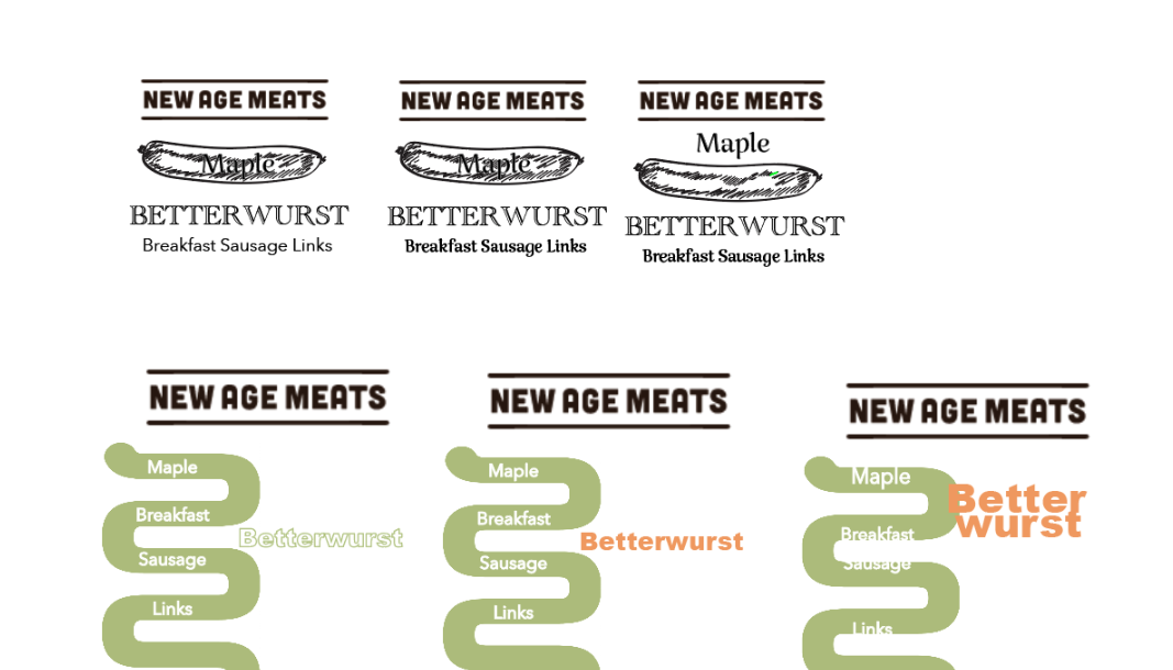
Wordmark Refinement:
With two sketch variations selected, I brought this into Illustrator to test out fonts, placement, and color positioning.


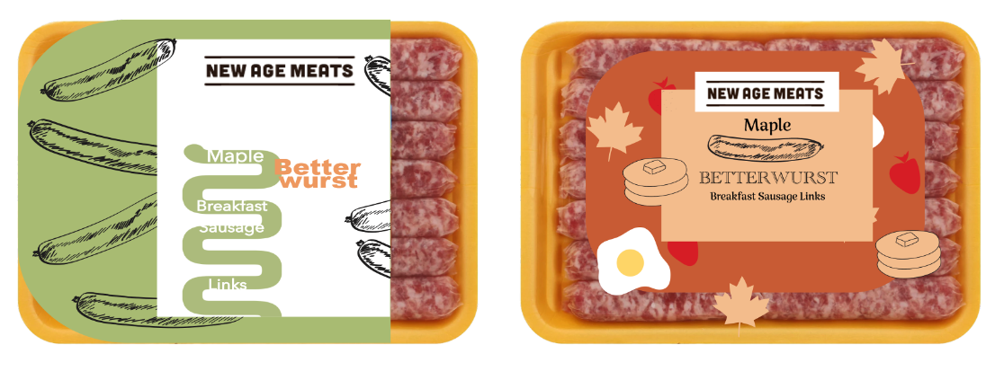
Packaging Iterations & Refinement:
With wordmark variations and packaging sketches selected I put them together and began mocking up how it might layout on the front packaging before and after the cutouts to show the actual product.
Wordmark Sketches:
Similar to mind mapping, sketching is a great way to get out as many ideas as possible to come up with a few you may not have thought of before.
At the end of this stage, I selected two variations. One a “traditional” approach and something more “fun” that reminded me of the carefree spirit of the ’60s and 70s.
Design Development
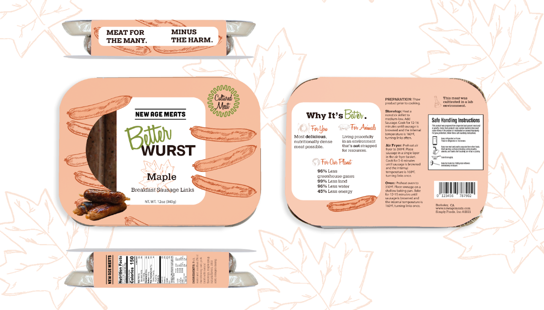
Final Design & Mockup
Unsettled with the wordmark, I returned to the drawing board and selected the typeface Honey Script to embody the charming nostalgia of the 60s and 70s (the childhood of our target demographic). Utilizing it sparingly for emphasis.
I Kept aspects of both initial packaging designs that worked well, such as the illustrations and the original squiggle from their established brand assets, but used the squiggle in a more deliberate way to draw attention to cultivated meat.
I also changed to the color of the packaging to one of the less saturated colors to create a better contrast for the product cutout and to avoid using too much green to avoid greenwashing.

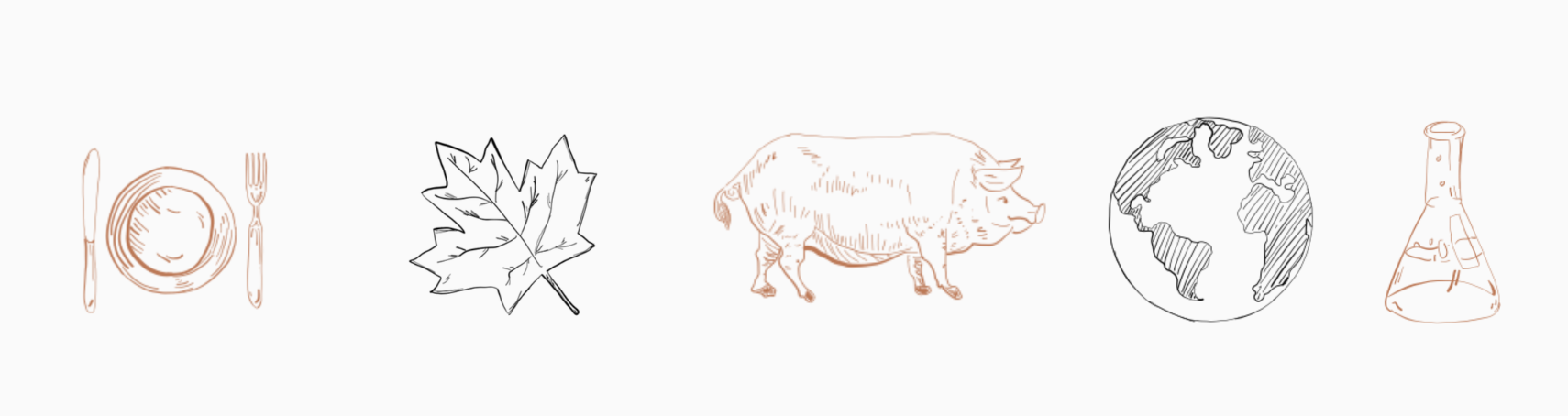
Asset Illustration:
Used to incorporate more of the visual tone to the back of the packaging to help their mission and some of the more dense content easily digestible (pun intended).

